
CASE STUDY:
Pawpaw’s Po’ Boys Mobile Ordering App
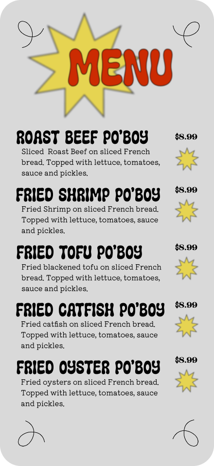
Pawpaw’s Po’ Boys is a beloved local staple that was facing declining lunchtime sales due to severe physical queue congestion. This case study details the end-to-end UX/UI design of a dedicated mobile ordering app built to streamline the pickup process, eliminate wait times, and preserve the brand's authentic neighborhood identity.
SUMMARY:
A competitive analysis and field research revealed that while customer loyalty remained exceptionally high, diners frequently abandoned the physical line during peak lunch hours (11:30 AM – 1:30 PM) due to slow-moving queues.
RESEARCH:
Strict Time Constraints: Local office workers with 30-minute lunch breaks cannot afford to spend 15 minutes waiting in line.
Complex Order Customization: Po'boys require highly specific ingredient modifications (e.g., "dressed," "no mayo," "extra pickles") that frequently get lost in translation over noisy phone orders.
Lack of Order Transparency: Customers tracking their lunch hour have no way of knowing exactly when their food will be ready for pickup.
USER PAIN POINTS:
This is a conceptual case study created for my Google UX Design Certification. Pawpaw's Po' Boys is a fictional business used solely for educational purposes.
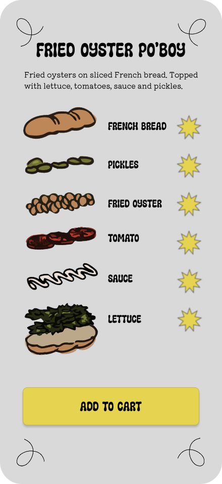
The visual customization engine replicates the counter ordering system with clear toggle switches for standard toppings to prevent kitchen errors by structuring modifiers early.
CORE FEATURES:
Hierarchy in design is featured through clear images depicting breads, protein and standard topping items.
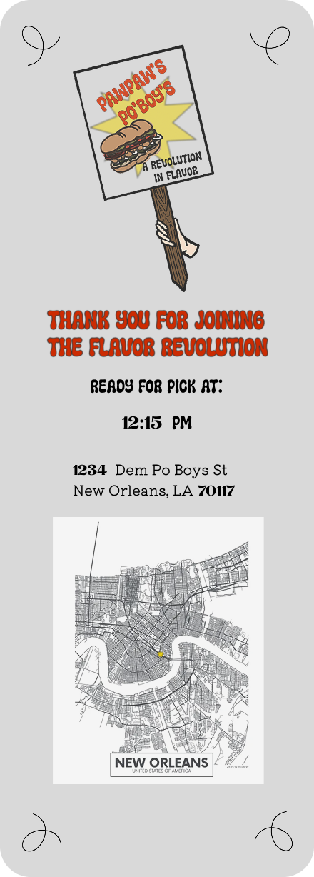
Scheduled pick up allows users to select a specific pick up time and integrates real-time kitchen capacity algorithms to prevent overbooking during rush hours.
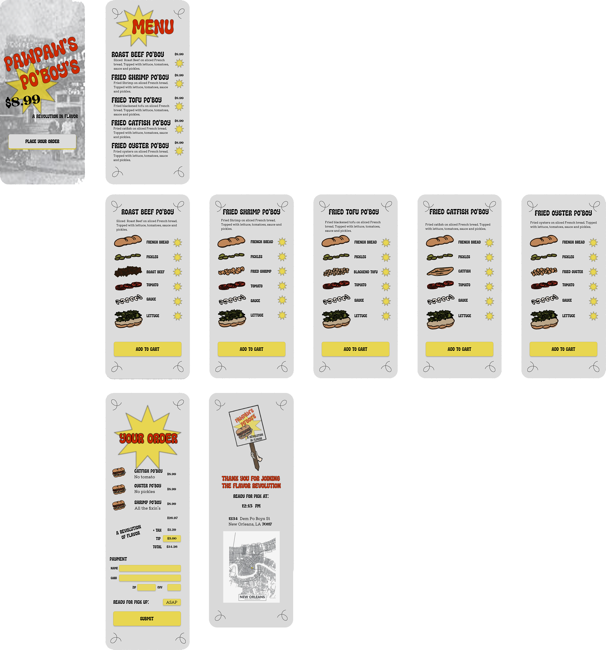
[Home Screen] ➔ [Menu Grid] ➔ [Visual Customizer] ➔ [Cart] ➔ [Time Scheduler] ➔ [Secure Checkout] ➔ [Confirmation]
Typography: Bold, retro headers to evoke nostalgia, paired with clean geometric sans-serif body text for optimal mobile readability.
Color Palette: Warm, appetizing colors like a deep Remoulade Red-Orange, Mustard Yellow and classic black and white.
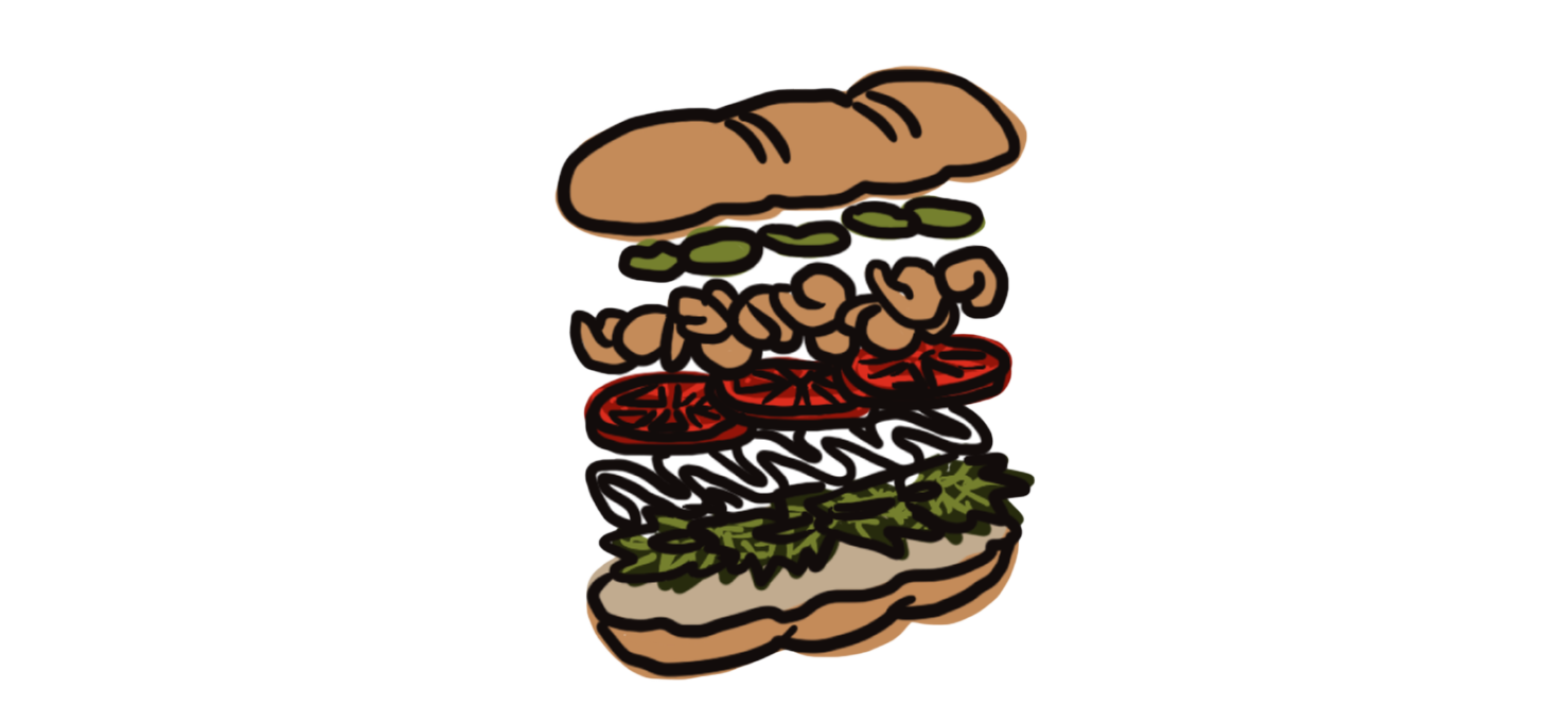
Image Strategy: Rather than use photographs of the food, using fun stylized illustrations adds whimsy and well labeled selections add clarity to the ordering system. Images make it easier for people that may have a hard time reading or speak another language.
DESIGN SYSTEM:
VISUAL DESIGN AND BRANDING


D9D9D9


ECD20A
EC370A