
Clarity in Design.
CASE STUDY:
Balancing a Rebellious Punk Brand Identity with Modern Web Usability.

Role: Lead UI Designer & Brand Strategist
Timeline: 3 Weeks
Deliverables: Desktop & Mobile High-Fidelity Prototypes
CONTEXT & CORE PROBLEM
Trauma Czars is a high-energy punk rock band from Colorado. Traditional music websites rely on slick, minimalist templates that completely destroy a punk band's raw, DIY brand authenticity.
THE DESIGN CHALLENGE
How do we design a digital space that feels loud, gritty, and underground, while maintaining flawless e-commerce checkout loops and intuitive navigation?
THE AUDIENCE (User Personas):
The Underground Gig-Goer (Alex, 24)
Quote: "I want to support local bands directly and know exactly when the next basement show is."
Pain Point: Sterile, generic web layouts feel fake; social media algorithms hide live gig updates.
To balance the band’s raw punk aesthetic with high usability, I conducted a mixed-methods research study. The goal was to understand the mental models of both fans and industry professionals to ensure the design met their distinct needs.
The Independent Talent Booker (Marcus, 38)
Quote: "I need to quickly vet a band’s draw and sound without chasing them across five platforms."
Pain Point: Disorganized bands with hidden email addresses or broken booking links.


#000000
Stark Black — Delivers high-contrast readability and aggressive graphics
#F1DD4A
Zine Yellow — Mimics cheap, vintage photocopy paper


Design System & Visual Hierarchy

Draconian Typewriter
Inter


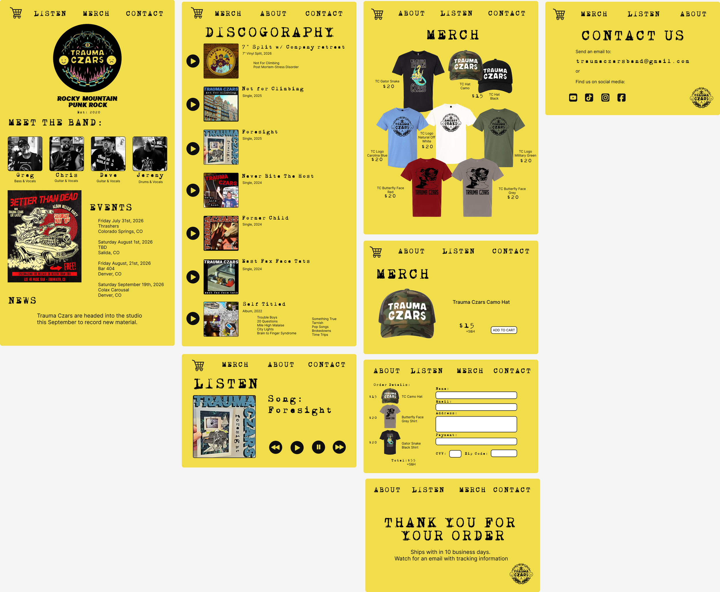
The visual style uses DIY posters and zines as inspiration. Swapping sterile white spaces for a raw, photocopy-textured yellow background and using distressed, stamp-like headers.
Keeping the navigation consistent helps keep the flow of the website simple. Allowing people to navigate the page intuitively.
Using aggressive, decorative display typefaces for major section headings to establish the punk aesthetic.